Free LIBRARY
OF PHILADELPHIA

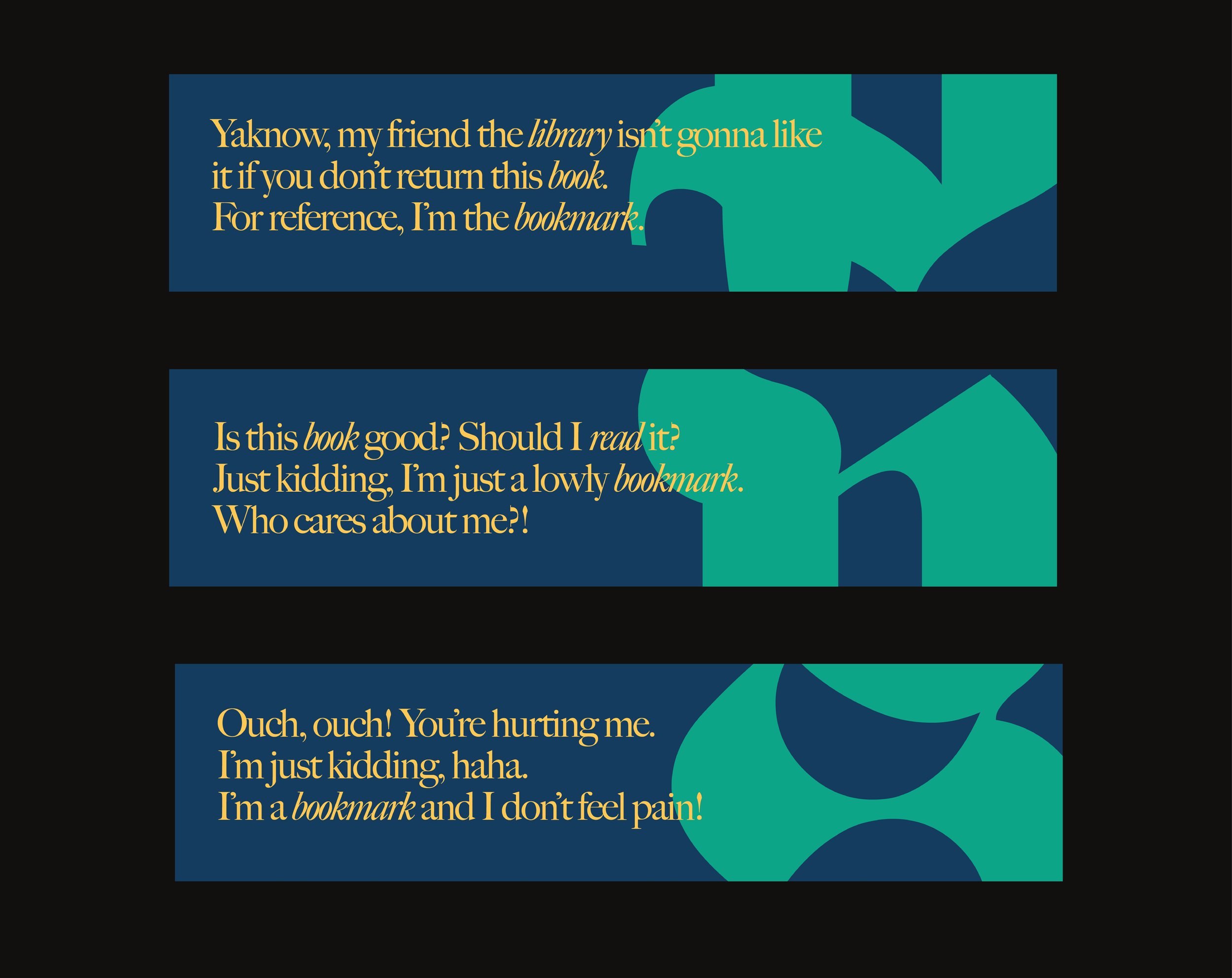
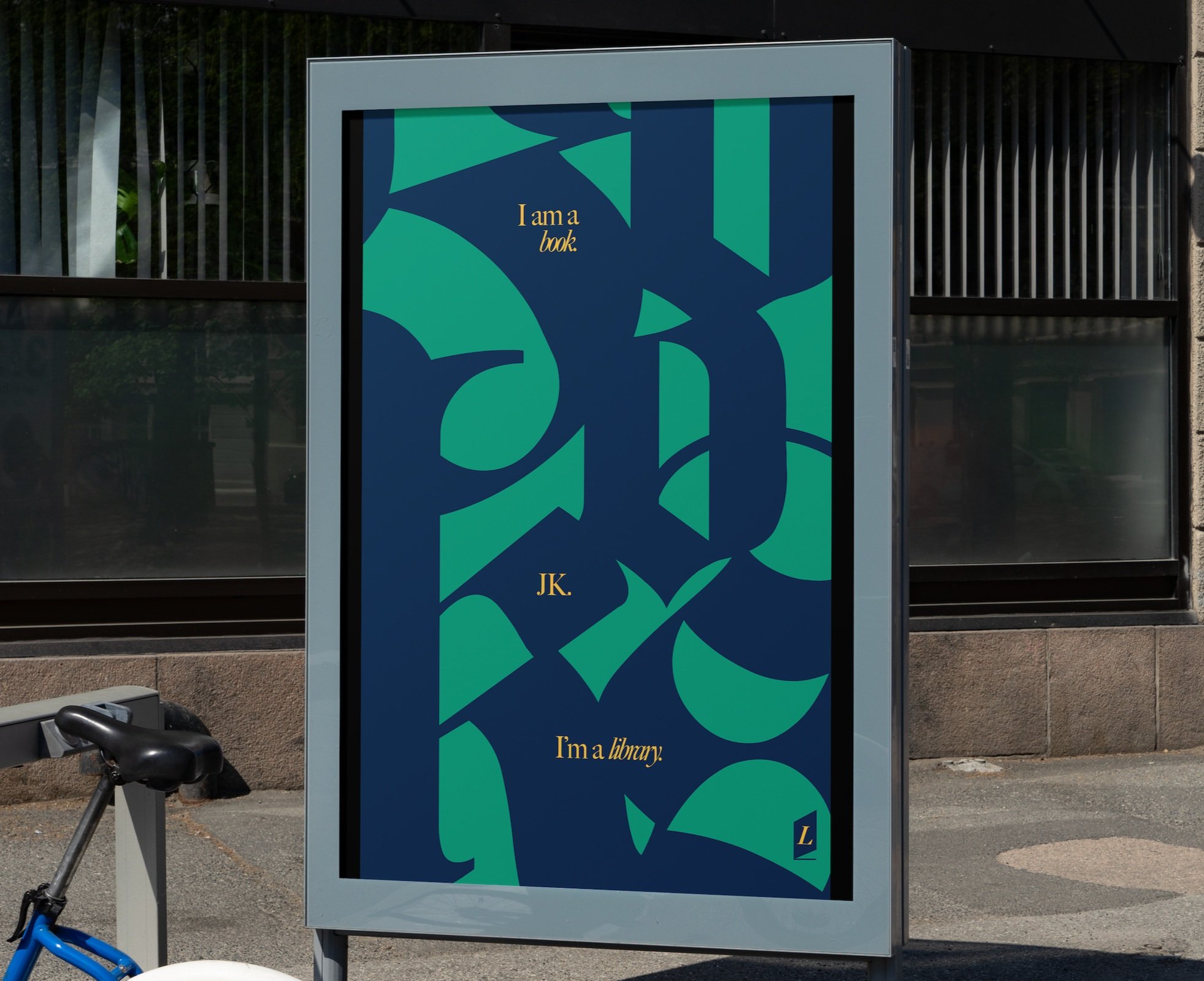
The Free Library of Philadelphia sits in a unique position between institutional history and modern relevancy. To reflect this, the rebrand contrasts historic and elevated typefaces with casual and comedic copywriting.

The copywriting is personal, but also approachable and down-to-earth, much like the library itself. It comes from the perspective of the personified library with very blunt, conversational phrases, which creates an awkward, deadpan humor.


The typeface “Fette Fraktur” is used as a graphic element to reference historic Gothic writing, whereas “Big Caslon CC” is used for legible copy to reference Benjamin Franklin’s printing history in Philadelphia.